Forum:The wiki has now an official Dark Mode
The wiki has now an official Dark Mode[edit]
Hi! Today starts the public beta of this wiki’s official dark mode!
This feature was highly requested but it has required quite a lot of tweaking to get it just working. It’s not perfect and some things might have been overlooked, so if you find something broken or unreadable while trying the dark mode, please, report it in the comments of this post so that it can be fixed. We would also be glad to hear your general opinion and feedback about it.
Some small things, like some native wiki buttons and gadgets, have proved too hard to customise with our current approach and have been left as they were if they were readable in both modes. We may try and customise those too in the future, but it will be some time yet for that to happen.
Also, the dark mode works better for logged in users. For anonymous users it may flicker on page load. That’s a known issue and it will (probably) get better after the beta ends.
Lastly: What does having a dark-mode mean for editors?
Well, having a dark mode comes with some restrictions. In general, try using just normal headers, text, links, tables and other templates, especially when writing your own templates. In particular, think twice before setting a custom colour inside a template.
If a customised look and feel is really needed, then the template will need to re-define all its possible content styles so that it doesn’t change between dark and light mode, that’s the approach the seasonal banners take (e.g.: Template:Rose). I’d recommend then to use only tested images, normal text and internal links (because external links and other gadgets have multiple states and are harder to customise). You’d also have to test for contrast: use a tool like https://app.contrast-finder.org/ and be sure that the text and link colours have ideally 3 points of contrast between them and 4.5 points against the background (and more is better).
There’s a third option, for templates that will be widely used along the wiki: moving their style to the common skin stylesheet and using CSS classes and the already defined CSS variables of the palette to adjust its style to correctly change between dark and light mode. However, this is a last resort, since bloating the general stylesheet with too many exceptions should be avoided to help future maintenance.
Again, I’ll be glad to answer any questions, opinions or concerns ^^
- Storm (talk) 00:38, 16 February 2022 (UTC)
- Dark mode generally looks great. Template:GuideNeedsWork does not and there's probably a bit more templates that need to have their colour schemes updated — Aximillio (Talk) 02:25, 16 February 2022 (UTC)
- Thanks! Template:GuideNeedsWork and some others should look a bit better now. Or at least readable in both modes :) Storm (talk) 14:45, 16 February 2022 (UTC)
- Thanks for fixing that! (I originally created that template and barely knew what I was doing.) Fynnkaterin (talk) 01:30, 17 February 2022 (UTC)
- Thanks! Template:GuideNeedsWork and some others should look a bit better now. Or at least readable in both modes :) Storm (talk) 14:45, 16 February 2022 (UTC)
- Seeing a couple issues using it with the Forum. The Topic lists are barely readable once you go into one of the Boards. See here. The main Index page looks fine though. The names on replies are hard to read here as well. Could barely see that it was Aximillio on the previous reply with it being dark blue on a dark background. They're fine outside the Forum though. JLucci (talk) 03:42, 16 February 2022 (UTC)
- Fixed signature =) Aximillio (talk) 20:02, 16 February 2022 (UTC)
- I love the detail of the streetlamp image changing. Fynnkaterin (talk) 01:29, 17 February 2022 (UTC)
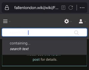
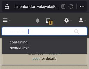
- One minor issue: in *both* light mode and dark mode on Firefox for iOS, text entered in the search form is barely visible:
(I checked, this also doesn't seem to depend on the theme being used for Firefox itself, it's always light text on light background.) Tirerim (talk) 04:50, 27 February 2022 (UTC)

